Gearing up for your next trade show? The answer is always yes, of course. Well, we’ve got just what you need to ensure your trade show graphics come together seamlessly. Below is a guide full of informative background knowledge, useful tips, and even some creative inspiration. Be sure to bookmark this page for reference throughout 2020 (and beyond).
The Fundamentals Of Trade Show Graphics
Brand Guidelines
No tool is more relevant to a graphic designer than your brand guidelines. (Tweet this!) Your brand guidelines are a compendium of all the assets and guiding points that make up your brand. They are invaluable to the graphic design process, as they limit inaccurate interpretation of your brand’s visual identity and help designers maintain brand integrity across different media.
Your brand guidelines include a number of visual elements and how they should be used:
- Company logo
- Company color palette and Pantone numbers
- Typefaces and fonts
- Icons
- Any other visual components that represent your brand
TerminologyTo ensure you can have informed conversations with your graphics team and any design-focused vendors, here are some important design and production terms:
|
Materials
There are a host of materials you can use to achieve different looks with your trade show graphics. Below are the most-used materials.
- PVC is a type of plastic that typically comes in 1/8 of an inch to an inch thickness rolled up in large sheets. It’s used to print with a direct-to-substrate printer and can be cut to size for the application. It has a matte finish and comes in white, black, and a suite of other colors depending on the brand (though in most cases you’ll print on white). PVC is cheap and versatile, so it’s widely used. Typical use cases include modular panel systems and 3D letters.
- Fabric is material used in dye-sublimated printing. Most fabrics are fire-retardant and polyester based. It’s lightweight, inexpensive to ship, and collapsible. Typical use cases include large overhead signs, wall graphics, and panel systems; silicon edge fabrics and silicone gaskets, specifically, are often used to slot into frames.
- Pressure-sensitive vinyl is adhesive material that requires force to stick to a surface. It’s versatile—you can apply a cast over it to change the finish (matte, glossy, etc.). Typical use cases include small logo applications (for sticking to objects), and wrapping a car or tabletop.
- Clear acrylic is a transparent material with various opacities and colors. You can use it to create depth, make transparent walls, create backlit graphics, construct product displays, and other trade show exhibit graphics. Plexiglas is a popular brand of clear acrylic that is often used interchangeably to refer to the material.
- Foam core is a lightweight but rigid material. The most common example is poster board. Foam core is good for freestanding applications, and it’s typically used for 3D letters, standalone displays, board or event signage, and wayfinding signage.
- Coroplast is corrugated plastic that is cheap, lightweight, and weather resistant. It’s good for outdoors, such as political signage you find in yards. It’s often used instead of PVC in outdoor applications.
Tips For Trade Show Graphics
Color
It’s essential to understand the Pantone Matching System to ensure that the color you want is the color you end up with when printed. In addition, for trade show graphics, you’ll need to be familiar with CMYK as well, since the large size of trade show exhibit graphics require specialized printers.
Pantone colors are spot colors printed with a specific mix of ink, so no matter what brand of printer is used, the same color prints. However, when printed for trade show applications—or any application that uses the CMYK color system for printing—the colors won’t be exact as the range of CMYK colors is limited. Still, you can use the Pantone Color Bridge Guide to match Pantone colors to their CMYK equivalents.
One more general tip about color: It changes depending on the light because light adds a color temperature. For example, if you’re looking at a graphic or object in your office versus outside in the sunlight, the color your eyes see will differ. So that means fluorescent, incandescent, LED, and natural lighting all make a given color appear differently. Keep this in mind because all venues have different lighting situations. Before printing for a trade show, check to see what type of lighting the facility uses so you can view the graphics in similar lighting to verify color accuracy.
Size
As we mentioned previously, trade show booth graphics can be very large. They could be the size of billboards, which you typically see from hundreds of feet away. However, attendees will be much closer to your graphics in most cases, so your assets should be appropriately sized for this scale of printing and have a high level of detail.
For example, if you are using raster stock imagery, you need very high-resolution source files so they show clearly. (Pulling a random image off the internet will not work!) Remember that if graphics aren’t appropriately sized, it will be difficult to impossible to get them remade in time.
Readability & Placement
When designing your assets, consider how they will be viewed, keeping these trade show banner design tips in mind:
- First and foremost: No tiny text! People will not read something that’s too difficult to see.
- For best visibility, place the most important messaging near eye level or above; otherwise, people may not notice it.
- Be realistic about what people will read (i.e., not everything you write).
- Dramatic, brief statements in large type work better than lengthy paragraphs if you want to catch someone’s eye from a distance.
- In general, try to use text sparingly with graphics. Text is better in a brochure or other handheld asset that attendees are more likely to read.
Proofing
This is the all-important final step before production. It’s your last chance to catch any mistakes or issues, and identify needed changes. Go over your graphics with a fine-tooth comb—even if you have once before. Check for accuracy and simple spelling mistakes.
Also recognize the difference between digital and print—it’s wise to review the digital version for mistakes and placement, but it’s not representative of color. That’s what the printed proof is for. When in doubt about color, the best way to review it is the same way the printer does—in natural sunlight.
Trade Show Signage Ideas
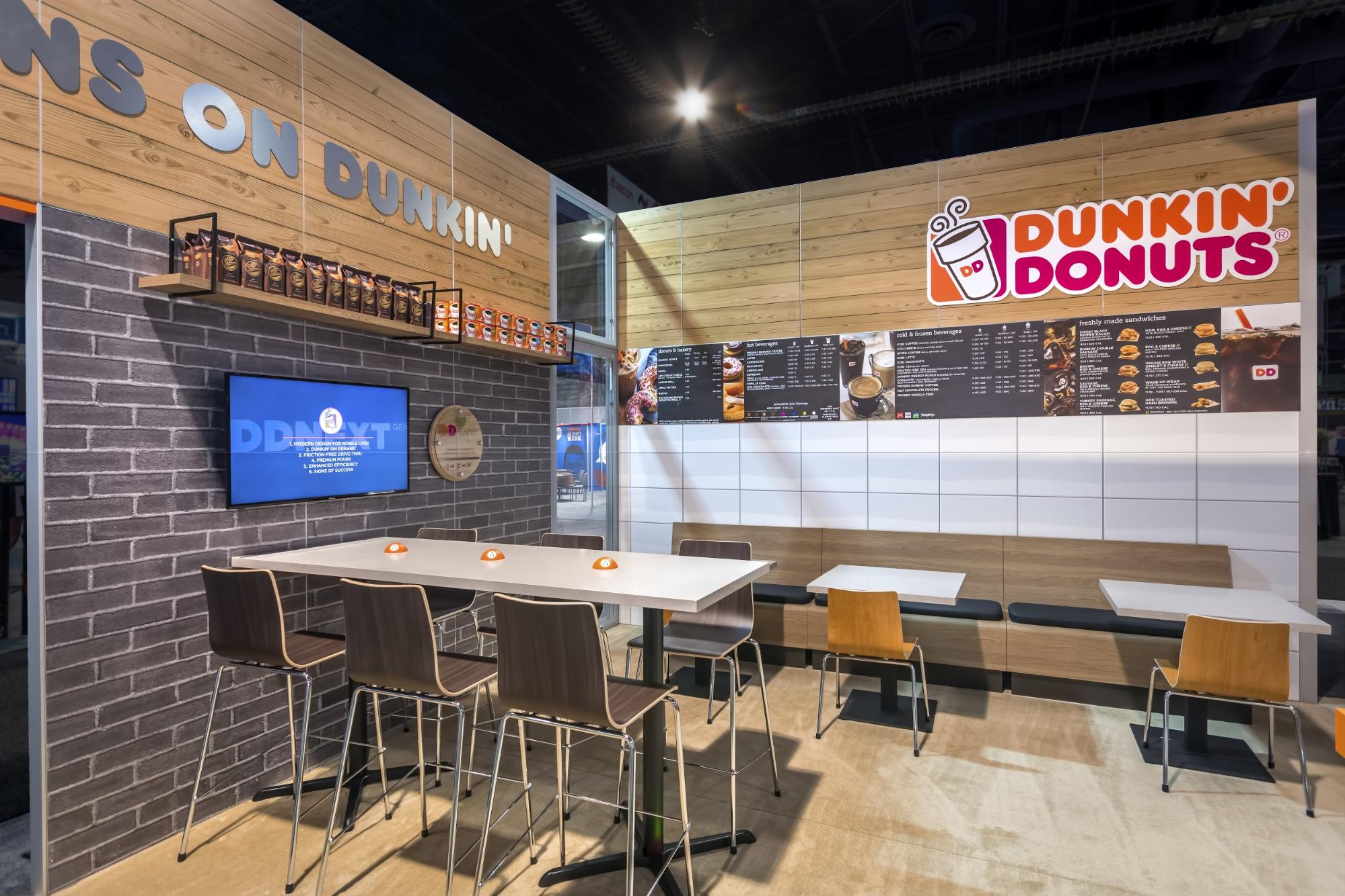
Putting what we noted above into practice, let’s look at a few trade show graphic applications. First up is Dunkin Donuts, which won an award for best use of graphics. They used PVC graphics to replicate the material and finish of actual Dunkin Donuts locations—a mix of gloss white tile, brick, wood, and other elements. This helped them get the feel they wanted without having to spend a lot of money on the actual materials.
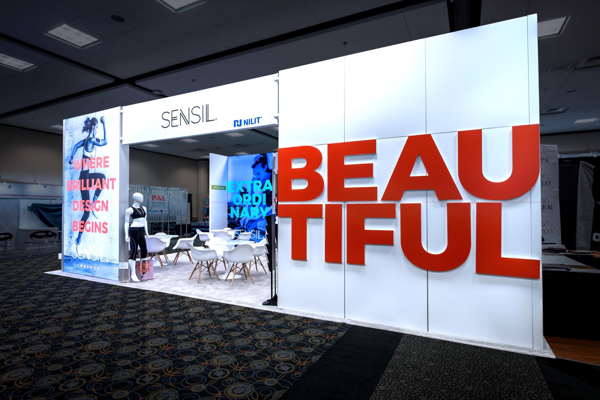
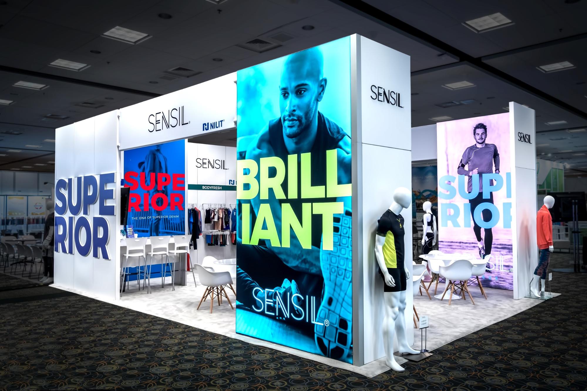
Next up is Nilit, which used gigantic letters made out of PVC for a trade show. The letters combined to form big, bold statements such as “Superior,” “Brilliant,” and “Beautiful.” Nilit paired these letters with backlit lightbox graphics made out of fabric.
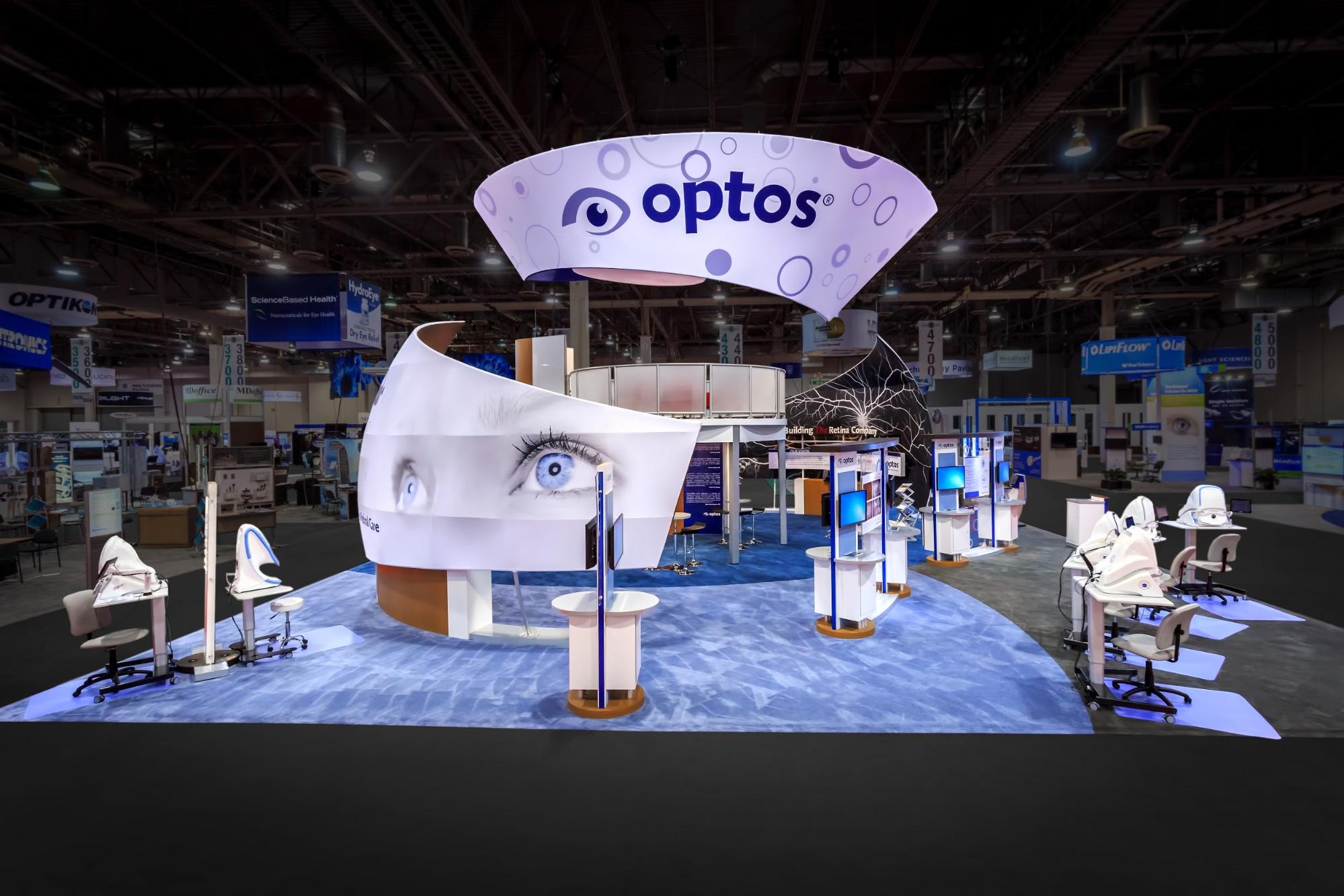
Optos offers another great visual for inspiring trade show signage ideas. This retinal scanning device company provides an extremely detailed view of the eyeball. To showcase just how detailed it is, they used actual image scans on printed fabric as trade show booth graphics.
Inspired by some of these trade show signage ideas? Reach out to us, and let’s go beyond signage to create an entire—and uniquely customized—space of your own.
Topics: Exhibit Designs, Featured, Trade Show Graphics