7 Standout Trade Show Booth Designs (& Ideas For Your Next Exhibit)
“In a busy marketplace, not standing out is the same as being invisible.”
Attributed to marketing legend Seth Godin, these words are incredibly relevant to marketers preparing for their next trade show. It’s not enough to have an interesting booth theme or fun activities to do. Your trade show booth needs to stand out among what could be hundreds of other exhibitors (especially your competitors!). In fact, the right trade show booth can mean the difference between a positive ROI and a lackluster turnout. (Tweet this!)
For inspiration, we walk through several cool trade show booth design ideas below. But before we explore those, let’s review a few tips on developing a memorable booth experience.
Trade Show Booth Design Tips
The most important thing to remember when designing your booth is this: Your theme should always tie in with your brand and the message you’re trying to convey to visitors. I’ve seen many great trade show booths that had interesting themes, but missed the mark with visitors because there was little to no connection to the company’s brand. Sometimes the design even felt gimmicky—something you never want associated with your brand.
To convert attendees to booth visitors and leave a lasting, positive impression on them, employ these tips as you design your next trade show booth:
- Know your audience. As a marketer, you know this adage all too well. But sometimes even the best of us forget to stay grounded in our audience’s perspective when inspiration strikes. Keep your audience in mind with every design decision to ensure the final output resonates strongly with them.
- Define the emotion you want visitors to feel. How do you want the people that visit your booth to feel when they walk away—excited, relaxed, trusting? It can be a traditional feeling or a more abstract concept. Either way, design with that feeling in mind. For example, at one of our trade shows, we wanted visitors to think, H&P is super cool, and I enjoyed my time at their booth. So we incorporated a few interactive activities like a Tetris game and a wooden puzzle bar, where visitors could sit and spend time with us while lightly engaged in gameplay.
- Give visitors options for interacting with your brand/team. Keeping in mind your audience, consider several ways they can interact with your team. For example, while your first instinct might be to make everything at your booth digital, not everyone responds the same to a digital-centric experience. Consider some analog activities for visitors who either aren’t tech savvy or just want the opportunity to disconnect.
- Be purposeful and creative with giveaways. Attendees know the difference between prizes you’ve bought for attention versus items that tie in with your brand. Swag should be memorable, meaningful, and on-brand.
- Train your booth staff well. Nothing ruins a great booth experience like technical difficulties and untrained staff. If your booth team doesn’t know how to work the equipment you’ve set up or is uninformed about what they should be doing and when, your visitors will leave with negative impressions. Ensure all your staff members are up to speed.
We put together a video on the above tips, which provides additional details. Check that out below.
7 Great Trade Show Booths
Purposeful design is paramount when designing a trade show booth and experience. To make the most of the limited space you’re given at trade shows, remember your reasons for exhibiting. When developing their conference booth display ideas, the companies below started their thought process with, What do we want to accomplish? instead of, We need X, Y, and Z. This perspective helped them create standout designs.
Cybereason
The company: Cybereason is a cybersecurity company that specializes in solutions for endpoint detection & response (self-remediation) and managed detection & response (24/7 monitoring and remediation by its team). It also offers multi-layered antivirus software and other monitoring, response, and analysis services.
The event: As you can guess, it’s a high-tech company. So its team exhibits at trade shows like the RSA Conference, which addresses the latest cybersecurity developments through keynote presentations, seminars, and information security events around the world. Cybereason exhibited at RSA’s 2018 conference with the booth below.
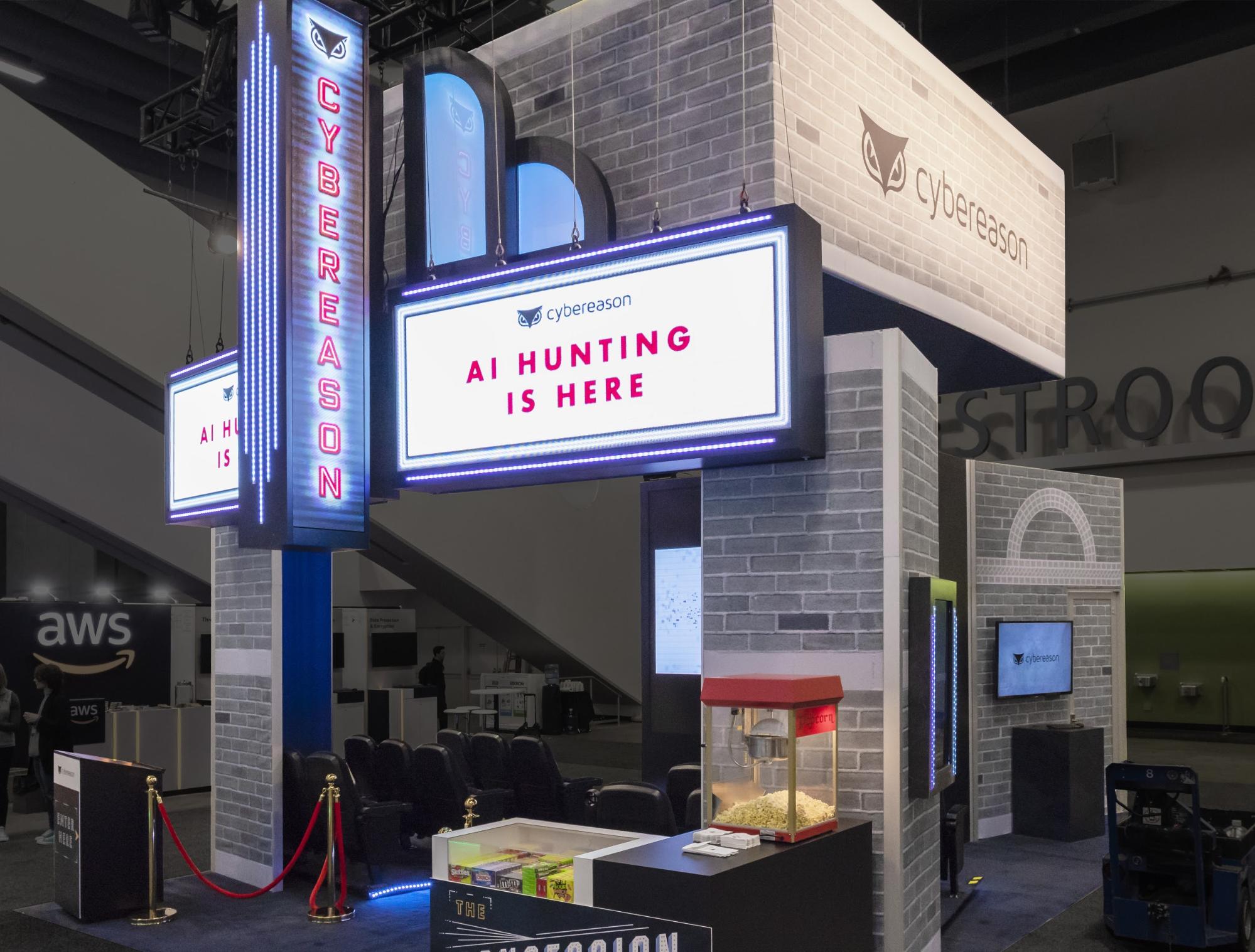
The booth: The main reason for exhibiting was to connect with visitors and generate leads. To do this in a memorable way, they considered the movie they had recently created about the history of cybersecurity—The Defenders. This served as inspiration for their booth theme.
Our team here at Hill & Partners helped them conceptualize, design, and execute on a classic movie theatre theme for their 20’ x 20’ booth. From a mini concession stand to signage to theatre seats, visitors were treated to a real movie experience (including popcorn!).
A trailer for the movie was played every 10 minutes, and all visitors who watched it received “tickets” to access the full-length feature. One lucky attendee from each trailer session even won a pair of Air Pods.
The Cybereason team was ecstatic about how everything came together, as well as how enjoyable the experience was for visitors. In fact, many people stopped to take pictures of the booth because of how it stood out among the 100+ other booths on the floor. Cybereason’s results also stood out: the team generated over 5,000 viable leads, a 300% increase in leads from the previous year’s trade show efforts. In addition, this exhibit won a silver Davey award in the Experiential & Immersive-Live Experiences category.
Foundry
The company: Foundry, a brand of General Cigar Company, is a tobacco company that makes a collection of themed, premium cigars inspired by steampunk, an artform that combines elements of the industrial revolution and nostalgic futurism.
The event: Foundry exhibited at the International Premium Cigar & Pipe Retailers (IPCPR) annual trade show, which helps tobacco retailers network and sell their products.
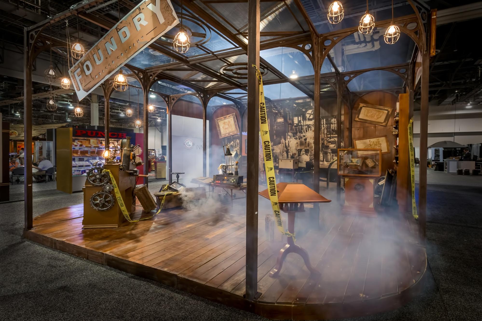
The booth: Given Foundry’s steampunk inspiration, the design of its 20’ x 40’ booth shouldn’t be too surprising. It mixed elements of the past and future, with visitors being transported from an industrial revolution’s mad scientist laboratory to the year 2064, where aliens are seen making cigars. Elements like “steam” (actually a smoke machine) added a realistic flair to the space, helping visitors immerse themselves in the experience.
The Foundry team was happy with the results: exhibit traffic increased by 45% compared to the previous year's booth, despite attendance being down 20% at the event. The Foundry booth also won a gold EXHIBITOR design award in the Use of Storytelling category.
Payfactors
The company: Payfactors offers cloud-based compensation management software that helps automate and centralize compensation data.
The event: Since Payfactors is in the HR space, its team exhibited at the 2017 Total Rewards Conference & Exhibition, an HR event for information and technology sharing across compensation, benefits, and other HR areas.
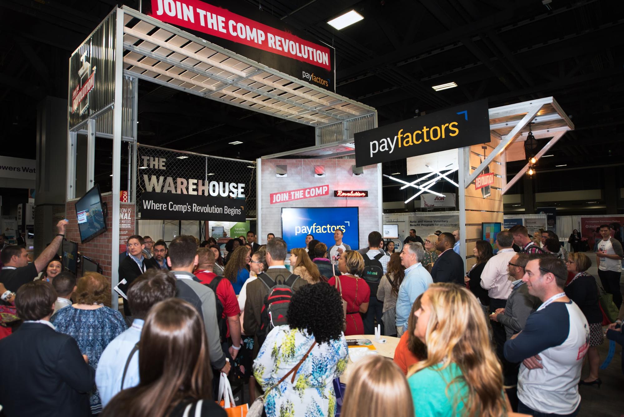
The booth: Since Payfactors was a newer company at the time, its team wanted their 20’ x 20’ booth to stand out in a “revolutionary” way. So that concept is exactly what we developed together—a revolution in compensation. We used brick, corrugated metal, plywood, and graffiti messaging together to create an urban, industrial feel. To keep attendees engaged and coming back for more, they also passed out Bluetooth-enabled bracelets that lit up when visitors were meant to return to participate in giveaways.
Payfactors’ trade show exhibition was extremely successful and accomplished exactly what the team set out to do—not only did their booth stand out, it also resulted in a 300% ROI. In addition, the booth won EXHIBITOR magazine’s award for Best Island Exhibit Less Than 600 Square Feet. One of numerous exhibition booth ideas we came up with, this concept definitely delivered on its revolutionary intention.
Scorpion
The company: Scorpion is an internet marketing company that helps businesses get more customers and grow revenue through services like website design, digital advertising, content marketing, and more.
The event: In 2018, Scorpion exhibited at the Dwyer Reunion (now called Neighborly Reunion), an event that brings together Neighborly’s 20+ brands to connect with one another and meet with vendors that may be able to help their businesses. Below is the booth Scorpion used at the event.
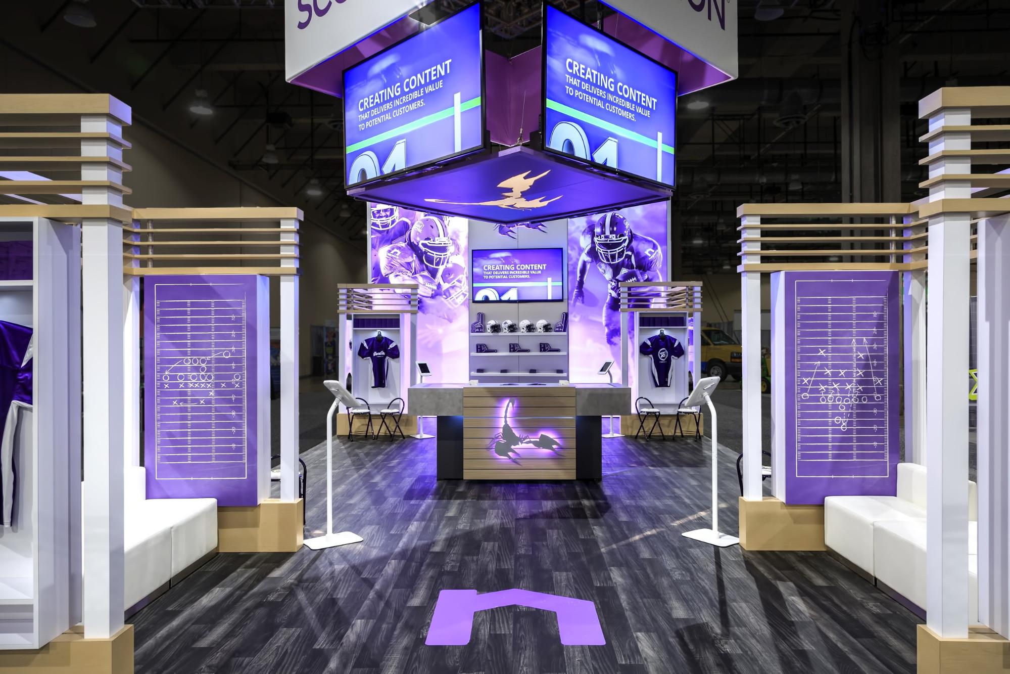
The booth: Scorpion is a preferred Neighborly vendor and wanted to connect with leaders of other Neighborly brands. Given the audience’s interests and Scorpion’s focus at the time on sports marketing, the Scorpion team collaborated with us to create this on-brand sports experience, complete with branded helmets and hanging jerseys to simulate a locker room.
In addition, the 20’ by 40’ booth included a jumbotron-like setup to mimic a football stadium and enlarged playbooks to evoke an on-the-field feel. Throughout the event, the screens played a mix of Scorpion content and a live sports game. This helped attract people from a distance. When visitors stopped by, the Scorpion team was able to hold informed discussions about their products and services through the embedded screens on the desk (not shown) and iPads.
The Scorpion team found it easy to draw in attendees and engage them with both the booth elements and product discussions. When visitors were able to tear themselves away from watching the game, they left with a memorable experience and a positive impression of the Scorpion brand. Scorpion’s booth also won a gold Hermes Creative award in the Print Media, Advertising, and Trade Show Exhibits category.
Rapid7
The company: Rapid7 is also in the cybersecurity space. Products from the company enable visibility, analytics, and automation for security operations (SecOps). It also offers services for managed detection & response and advisory, among others.
The event: Also a high-tech firm, Rapid7 attended Black Hat, an information security event series that provides attendees with information security research, development, and trends. The Rapid7 team exhibited with the booth below in 2016.
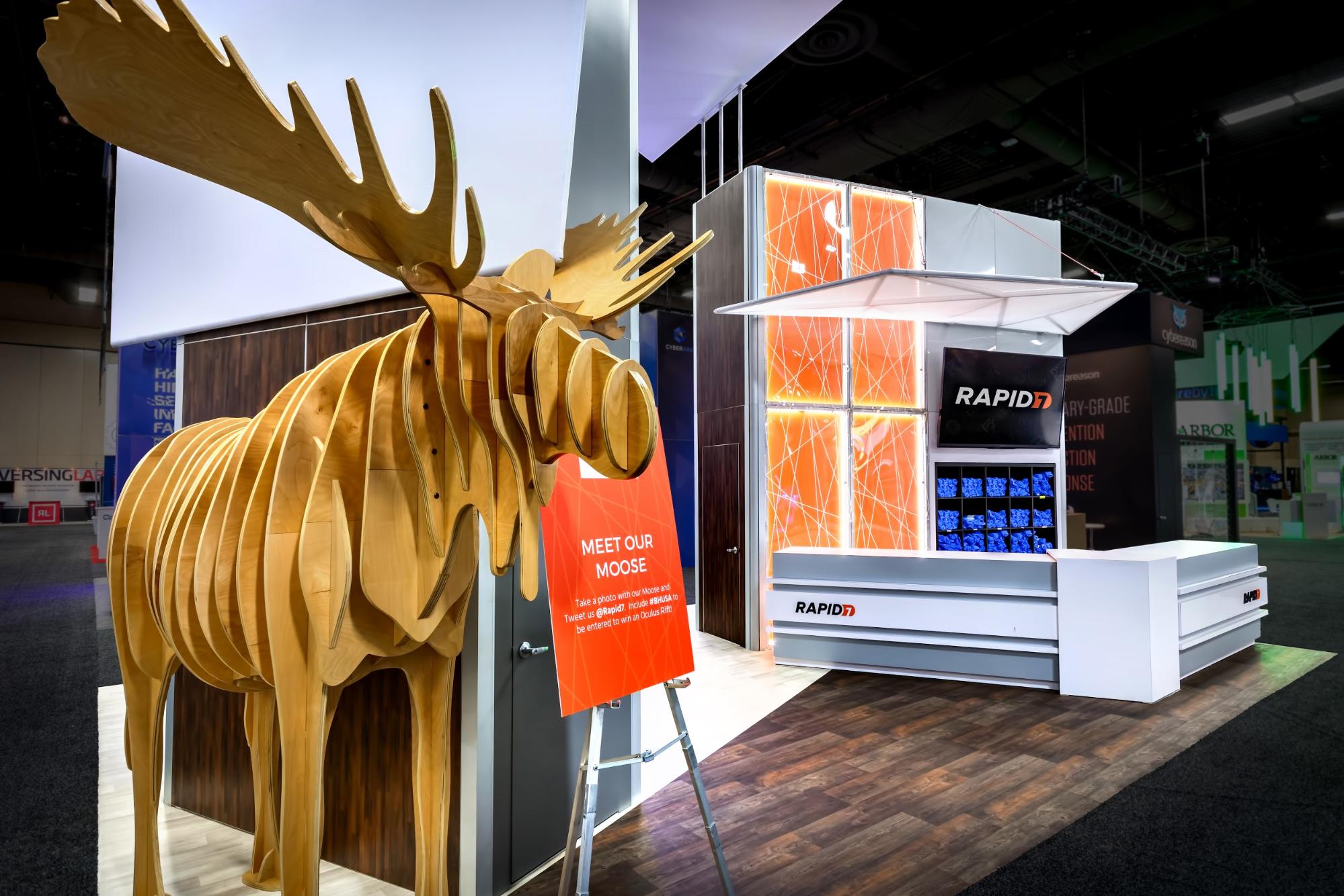
The booth: Yes, that’s a moose. It’s actually their internal mascot, which ties in with the rest of the theme—showcasing the internal look and feel of Rapid7 to people outside the organization. All elements of the 20’ x 30’ booth—including the brand colors, wood paneling, and deck containing small meeting rooms—were inspired by its headquarters in Boston.
Most people in the industry know of Rapid7 in part due to the big party it hosts in Las Vegas every year. Attended by thousands of engineers, analysts, and hacker types, it helps raise and maintain brand awareness with a good-time feel. It’s a pretty big deal, and the booth drew a never-ending line of 100+ people who wanted to get tickets.
But the moose also served another purpose: to generate social engagement. After all, who doesn’t want a picture with something as unique as a wooden moose? Visitors who uploaded a picture with the moose and used the company’s hashtag on social media got to skip the line. (Plus they got a free shirt!)
The Rapid7 team loved the creativity we employed, and how we were able to maximize their booth footprint. And their moose received a ton of shares on social media, helping spread brand awareness.
Newgistics
The company: Newgistics is a logistics and technology company that helps ecommerce businesses with tech solutions, hosting & managed services, and fulfillment.
The event: With their focus on ecommerce, Newgistics took to the Internet Retailer Conference & Exhibition (IRCE), a trade show for e-retailers to stay up to date on the ecommerce industry and connect with potential vendors.
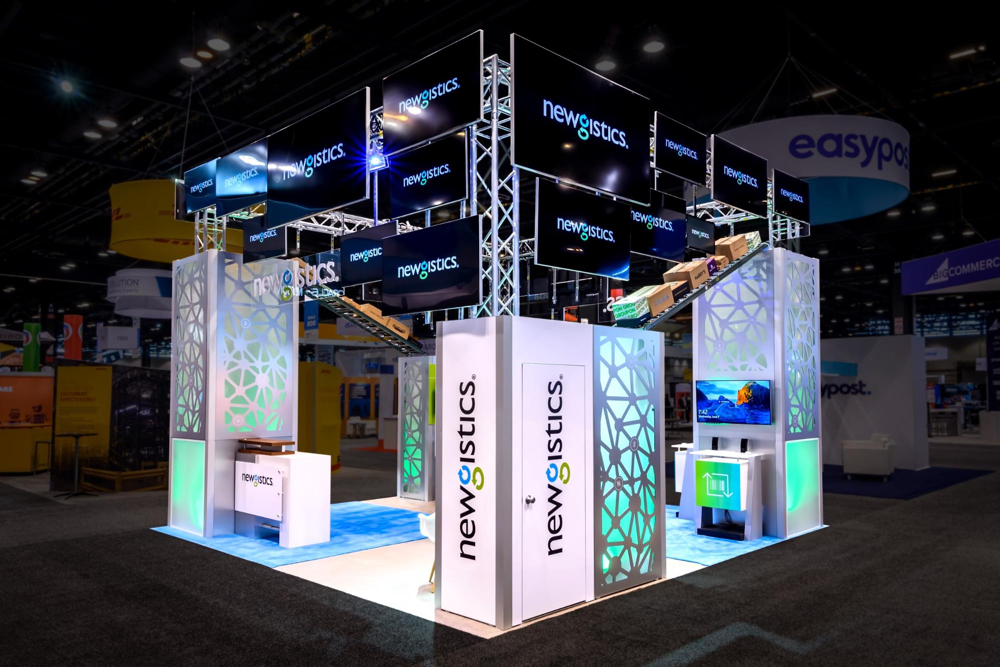
The booth: Given Newgistics’ goal of generating leads, its team wanted a space that attracted people from across the showroom floor. A key part of this was making use of vertical space within the 20’ x 20’ booth, which we did with a collection of layered, multi-sized monitors. In addition, the booth featured boxes that were branded with logos of their clients. These boxes coupled with metal rollers helped visitors connect with the logistics focus of the company.
The Newgistics team enjoyed the final product and valued our choice of multiple monitors over the typical large, tiled screen since it saved them money and helped the booth stand out.
eBay
The company: eBay is an online marketplace that facilitates consumer-to-consumer and business-to-consumer sales of a wide variety of products—electronics, baby items, home goods, fashion apparel, and much more.
The event: Since eBay touches on a multitude of markets, it sends teams to many types of trade shows throughout the year. The booth pictured below was at the 2019 National Association of Music Merchants (NAMM), an annual event that brings together the music, sound, and entertainment technology communities to network and seek out innovative products from each of those markets.
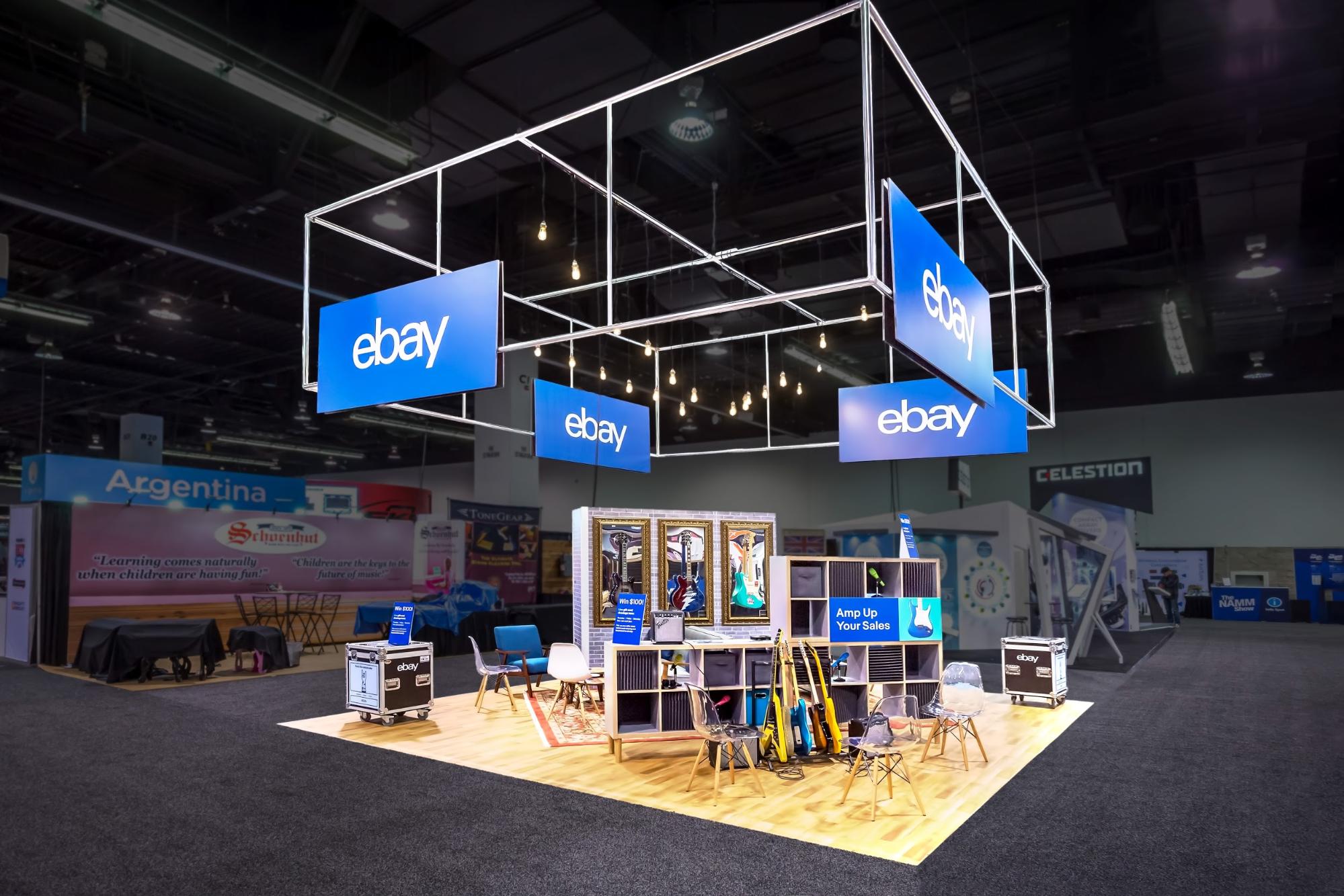
The booth: eBay’s main goal in attending NAMM was to let major music product brands know that eBay is a great place to sell their music products. Hence the guitar-themed, 20’ x 20’ booth. The eBay team wanted a comfortable, cool feel, so we made the booth very open, even keeping the hanging frame with ebay’s logo signage unwrapped to further open the space.
Guitars, amps, records, and other music memorabilia donned the area to encourage casual talks about music and even impromptu jam sessions. Also, it may be hard to see in the image, but those aren’t paintings in the back—they are real guitars in front of mirrors. These added a unique, artistic flair to the space.
The eBay team loved what we created and how we were able to mold the space based on the event, but still keep it connected to their brand. They also appreciated how easy it was to collaborate with the entire Hill & Partners team.
Do you have a trade show display design idea you’re excited about? Tell us about it. We’d love to help bring your idea to life at your next trade show.
Topics: Exhibit Designs, Featured

