Demystifying The 4 Types Of Trade Show Booths
Did you know there are actually four different types of booths you can create for trade shows? Booths have different characteristics that involve how they are positioned on the trade show floor and accessible, as well as the allotted space. Below we cover the exact differences between the four types of trade show booths, a few quick tips to maximize usage of each booth type, and some great examples of each booth in action.
4 Types Of Trade Show Booths
1. Island Booth
Island booths are open to show-floor aisles on all four sides, meaning the interior is often highly visible regardless of which direction you approach it from. Booth dimensions range, but they tend to be 20 feet by 20 feet or larger. The size of your island is typically only limited by budget or show restrictions, with 5,000 to 10,000-square-foot spaces being more common than some might think.
Use an island booth when you want to maximize visual space. You have the opportunity to include marketing messaging on all sides (Tweet this!), and there are typically fewer restrictions around hanging signs compared to the other types of trade show booths. You also gain the flexibility to determine how attendees will come into, move about, and exit your space. Not to mention there’s more breathing room between your booth and those of the other exhibitors.
Quick tips to make the most of an island booth:
- Each side of the booth is highly visible, so be sure to take advantage of that. You never know where an attendee will be approaching from.
- If the island is large, incorporate enough free space to avoid overcrowding, which will improve the attendee journey.
Island Booth Example: Scorpion (at ServiceWorld)
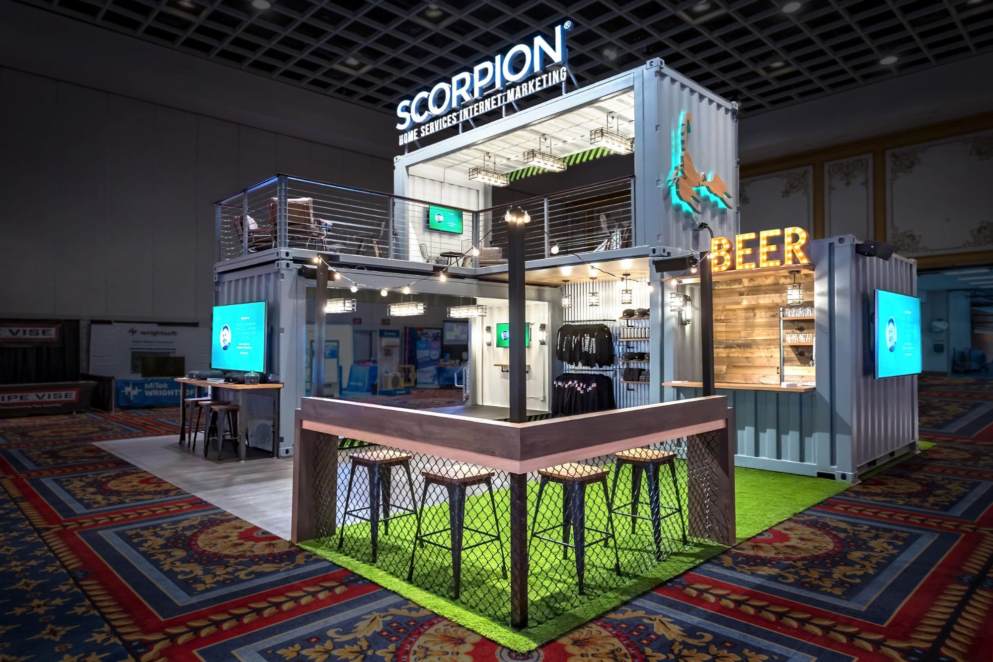
This 30-by-30 island booth was constructed using shipping containers, which comprise the majority of its architecture. Scorpion’s Branded Environment takes advantage of the flexibility of an island through easy access on three sides, with stairs leading up to the second level tucked away in the back.
Island Booth Example: Misfit (at CES)
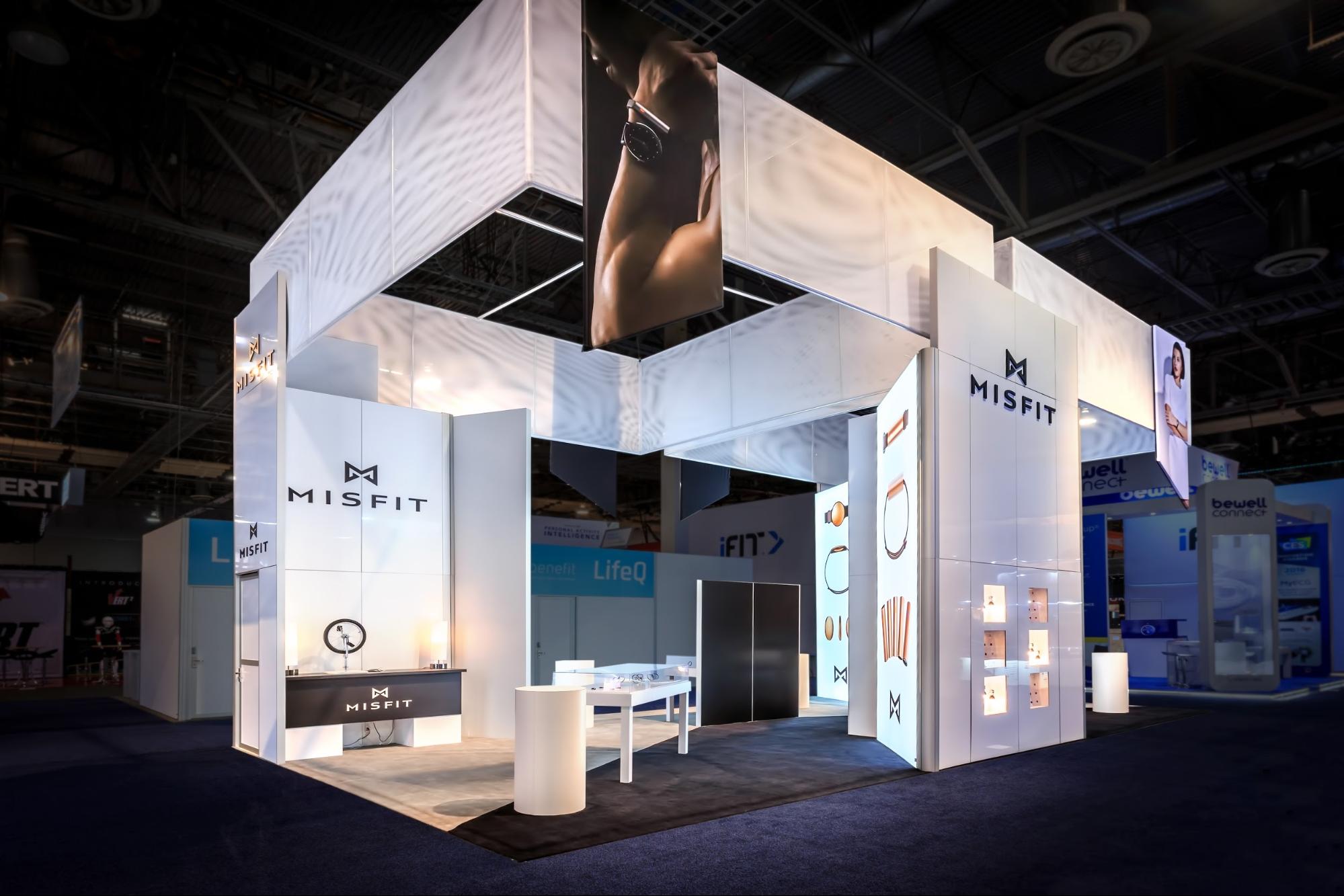
This 20-by-40 island booth makes use of all four aisles to display products and offer attendees different ways into the exhibit. Since CES is such a busy and well-trafficked show, it was important for Misfit to be highly visible and easily accessible.
Inspired by these stunning Branded Environments? Let us help you create a uniquely customized space of your own.
2. Peninsula Booth
Peninsula booths have aisles on three sides, and they share a wall with another exhibit. Think of the peninsula as the middle child—it tends to be smaller and less expensive than an island but more expensive than perimeter and linear booths. Dimensions are typically 20 feet by 20 feet or moderately larger.
If you want some flexibility without the higher price tag of an island, a peninsula booth is a great choice. You may not have enough messaging or materials to warrant four sides, so you can invest more in the rest of the space.
Quick tips to make the most of a peninsula booth:
- Know the rules and regulations regarding the exterior wall you share with the other booth. Typically, the wall must be plain and devoid of branding. If you have to make changes to comply, it can be challenging, costly, or visually unappealing—some shows force you to use unattractive piping and drapes.
- Like the wall, find out in advance what can and cannot go on any hanging signage facing the exterior wall.
- Ensure the attendee journey can be accomplished within the three-sided configuration—sometimes the missing aisle/entrance can throw off an otherwise well-designed activity.
Peninsula Booth Example: High Sierra (at Outdoor Retailer’s Summer Market)
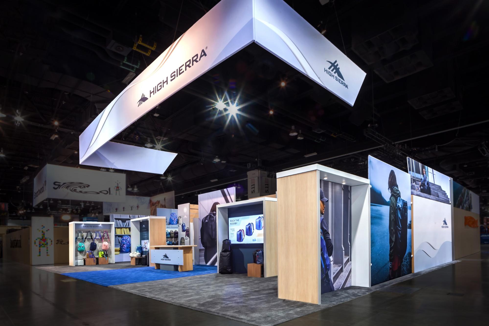
This 30-by-40 peninsula booth uses walls on two aisles to funnel attendees to the front, ensuring they start at the reception desk. High Sierra products line the walls, and there are a couple of meeting areas along the back wall, enabling staff to sit down and have private discussions with visitors and clients.
Peninsula Booth Example: Khombu (at Outdoor Retailer’s Winter Market)
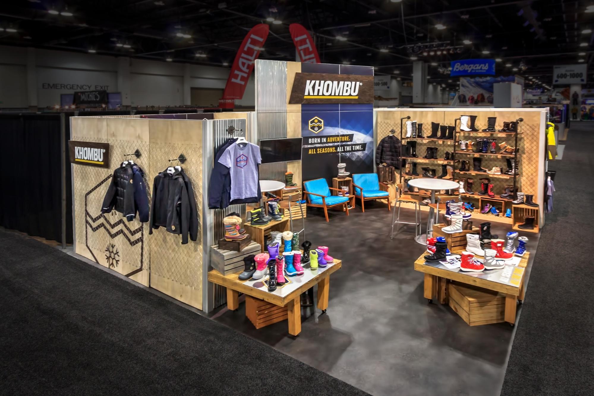
Khombu used a 20-by-20 peninsula with an open, asymmetrical layout to grab attendees from two aisles. The back wall that faces the adjacent exhibit extends upward 12 feet to ensure the Khombu brand can be seen from a distance—important since the Branded Environment features no hanging signage.
3. Perimeter Booth
Perimeter booths are similar to peninsulas—one side will not be accessible—except these booths are on the outer perimeter of the trade show floor. Perimeter booths can be L-shaped if in a corner, meaning their dimensions often skew away from the traditional square—they start at 10 feet by 10 feet, and often come in 10-by-20 arrangements.
You may consider a perimeter booth if you want to maximize your vertical visibility, as these booths tend to have relaxed height restrictions. You also don’t have to worry about the back wall since the space beyond it isn’t walkable.
Quick tips to make the most of a perimeter booth:
- Be aware of whether your space is sharing a wall with an exhibit; if so, you’ll need to know the rules and regulations on wall-sharing (like with a peninsula).
- Make use of the perimeter’s unique dimensions—they may even influence your design concept.
- Confirm that the design you come up with works comfortably in the space.
Perimeter Booth Example: Scorpion (at MTMP)
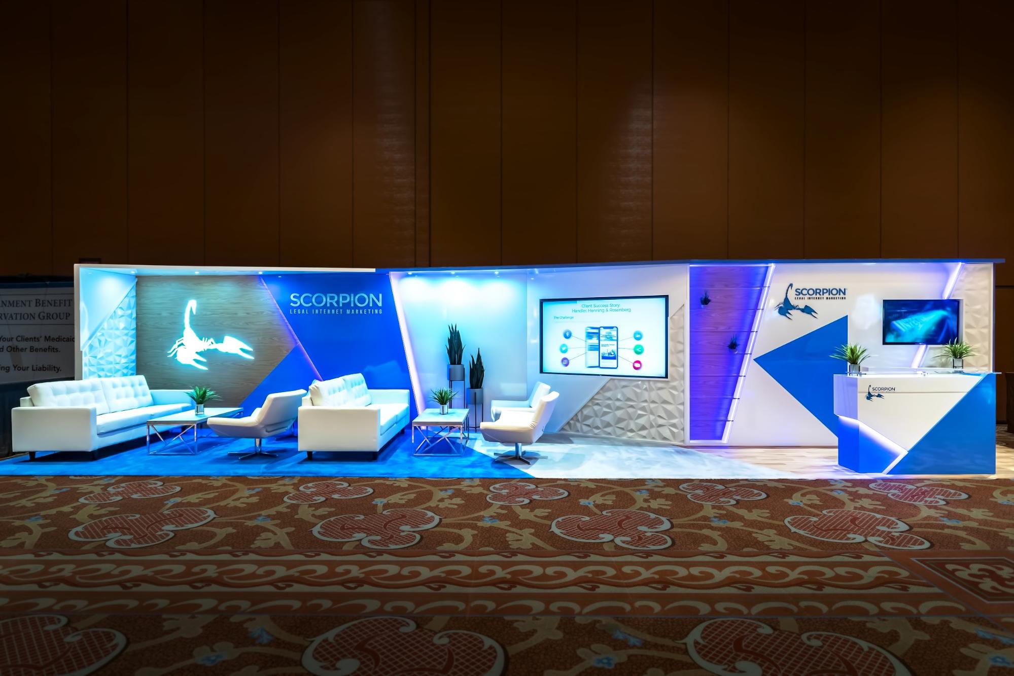
This 10-by-40 booth is both a perimeter and a linear type. Through efficient use of space, it features two seating areas, a presentation area, and a reception area. Dramatic, refined architecture and lighting details set this Branded Environment apart from everything else around it.
Perimeter Booth Example: Super.natural (at Outdoor Retailer’s Winter Market)
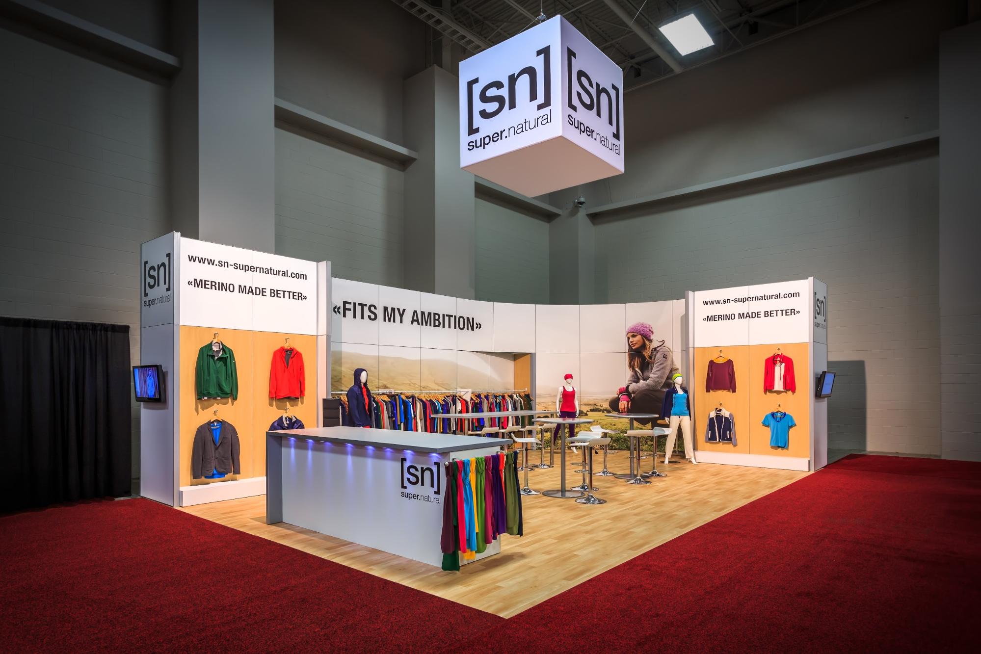
Super.natural employed a simple 20-by-30 perimeter booth nestled in the corner of the exhibit hall. It takes advantage of the placement by creating an open and accessible space. The square hanging sign is unique in its size, reflecting the proportions of the brand’s logo.
4. Linear Booth
Linear booths are the most common types of trade show booths. They are mostly accessed by one show aisle—or two if located in a corner. Linear booths share at least two walls with other exhibits. The most common dimensions are 10 feet by 10 feet, but they can be slightly larger.
The linear booth is the least expensive option. So if it’s important that you have a presence at a show but you’re also budget-conscious, linear is the way to go. Just keep in mind these booths have the most limitations—limited space, limited accessibility, limited visibility, and so on. Plus, an enclosed space tends to feel smaller.
Quick tips to make the most of a linear booth:
- Be aware of height restrictions because you typically can’t go as high as other booth types.
- Use considerate design to make the best use of the space.
- Staff sparingly—with so little space, you don’t want to overpopulate the booth.
Linear Booth Example: Mapbox (at AWS)

This is a 10-by-20 linear booth flanked on two sides by neighboring exhibits. It features two presentation areas on the left and right, and a large video tile screen in the center. The video screen was used to display the brand’s map technology in dramatic fashion.
Linear Booth Example: ThreatConnect (at RSA)

ThreatConnect’s 10-by-10 linear booth used bright graphics to stand out amongst the competition. The space has a simple back wall with a small closet and screens, but the elements work well together and give the brand great presence on a crowded show floor. On the right side is an example of a divider wall of piping and drapes.
Whether you’re looking to go big with an island booth or staying budget-conscious with a linear booth, we can help your Branded Environment stand out from the crowd. Reach out to us to talk about creating a uniquely customized space.
Topics: Featured, Branded Environments, Trade Show Booths

