When you enter a space—such as an office building, subway station, or trade show booth—you want a clear idea of where to go, what to do, and how to feel. Environmental graphic design addresses all these concerns, but how? We answer this question below, as well as provide several examples and best practices.
What is environmental graphic design?
Environmental graphic design (EGD) is the use of graphic elements such as typography, color, imagery, and textures to curate and enhance the experience people have within a space. (Tweet this!) Each graphic element plays a different part in curating people’s experiences:
- Color can change the mood of the space, making it energetic, somber, playful, and so on. It can also help categorize, contextualize, highlight, or otherwise differentiate a space, or portions of a space.
- Typography communicates information through text for the purpose of wayfinding, labeling, identifying, marketing, selling, etc.
- Imagery also communicates information, only through graphics instead of text. It also evokes emotion.
- Texture adds an extra dimension to the space. The sensory element of touch adds depth—both literally and metaphorically. It can evoke emotion as well, and help people more clearly connect with the space. For example, if you wanted people to feel like they were in nature, you might include tree bark on the wall or on standalone objects.
The visual cues provided through EGD help connect people to places in two key ways:
- Environmental graphics inform people on how to navigate a physical space, a process called wayfinding. For example, airports use varied signage to let visitors know where to go for gates, baggage claim, and other important areas. Similarly, street signage helps drivers know where to exit on freeways for specific streets, and when to stop at intersections.
- Visual cues impart information about a place to make it more familiar, a concept referred to as communicating identity. They may serve as verification that people are where they need to be, for example a retail store or a place such as a train station. Graphics used in a children’s museum will differ from those in a museum for adults—the former will likely employ brighter colors for a more energetic feel versus muted colors for the latter. Visual cues may also be a form of branding, communicating identity using logos and related imagery to make a connection between the brand, the space, and the person.
Environmental Graphic Design Vs. Branded Environments
Branded Environments are popular in the trade show space, but they shouldn’t be confused with environmental graphic design, which is only a single aspect of Branded Environments, albeit a critical one. Branded Environments include everything that goes into creating a space: physical architecture, how a space is planned, emotional cues, and more. Environmental graphic design helps augment a Branded Environment.
Environmental Graphic Design Best Practices
Now that you understand what EGV is, here are a few best practices to optimize your use of it.
Wayfinding
- Don’t overwhelm people with information. People can only absorb so much information at one time, so be mindful of what you choose to call out in graphics. For example, everyone at an airport terminal doesn’t need to know how to get to every gate at every juncture—so you’ll see signs that have a range of gates for a given direction, such as “Gates C1–C10” with an arrow pointing left.
- Highlight decision points. When someone needs to decide on a direction or action to take, such as at a fork in the road, it’s important that signage be present to direct them.
- Contextualize different areas of a space. It’s key to differentiate sections of a space through elements like color, especially if the space is large. For example, an airport typically uses varied colors to denote different terminals. Similarly, conferences often use varied colors to identify different tracks.
Environmental Graphics
- Pay attention to text placement. Consider where people will be looking when you’re placing things in a space. For example, don’t place text low on a graphic that’s at eye level or below because people won’t read it. Similarly, if you’re hanging a sign high up, make sure the text is large enough to be read from a distance.
- Be careful with color. Since color has a significant impact on the feel of a space, be sure to select colors that promote or evoke the feeling or mood you want to convey. For example, red is often synonymous with energetic; blue is more about feeling safe; yellow evokes happiness; and green promotes nature and healthiness.
- Consider the light source. Light can change how people perceive and experience color. For example, incandescent light has a warmer hue, whereas fluorescent light is colder.
- Incorporate texture. It’s easy to forget about texture and keep everything flat, especially when physical materials can add costs. However, texture can have a palpable effect on how people feel and interact with the space, and even the people around them.
- Less is more. Don’t go overboard with visual cues—they will lose their impact and may even confuse people. Even individual graphics should be fairly simple. Consider your main message or the needs people will have in the space, and design your environmental graphics accordingly.
We can help you put these best practices into, well, practice! Let us create a uniquely customized space for your brand.
Environmental Graphic Design Examples
1. Payfactors’ Commercial Space
In 2018, Payfactors moved to a new office that its team wanted to turn into a branded space. We accomplished a large part of the branding through environmental graphic treatments.
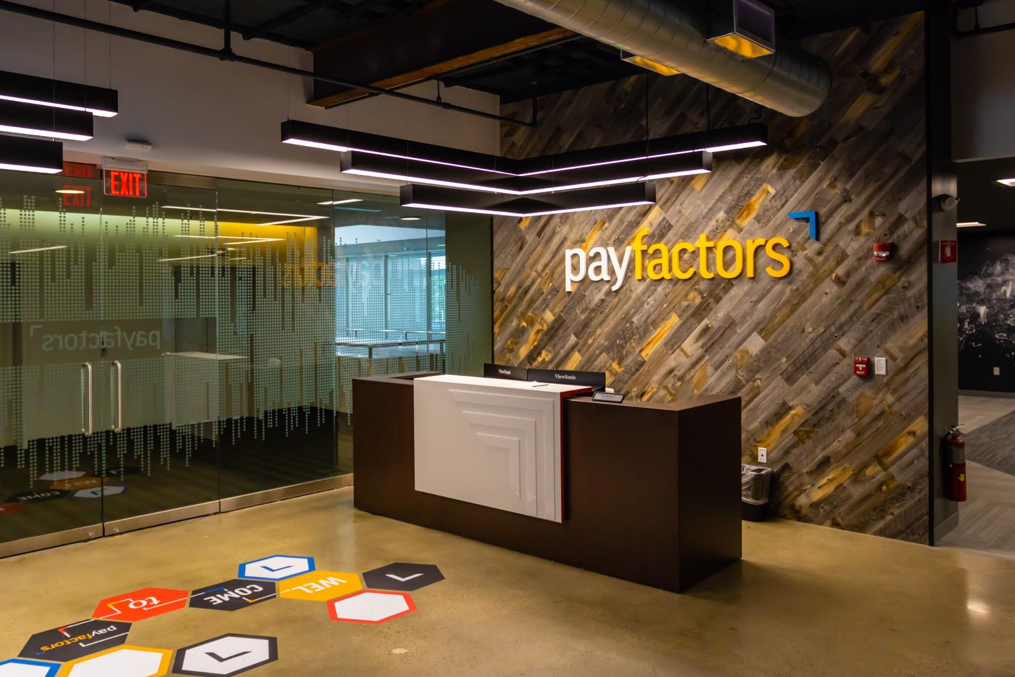
The front lobby includes a graphic on the window that helps delineate the space without blocking visibility. Graphics on the polished concrete floor welcome visitors into the space. The reception desk features a dimensional representation of Payfactors’ arrow logo on reclaimed wood. Even the lighting takes the form of its arrow logo.
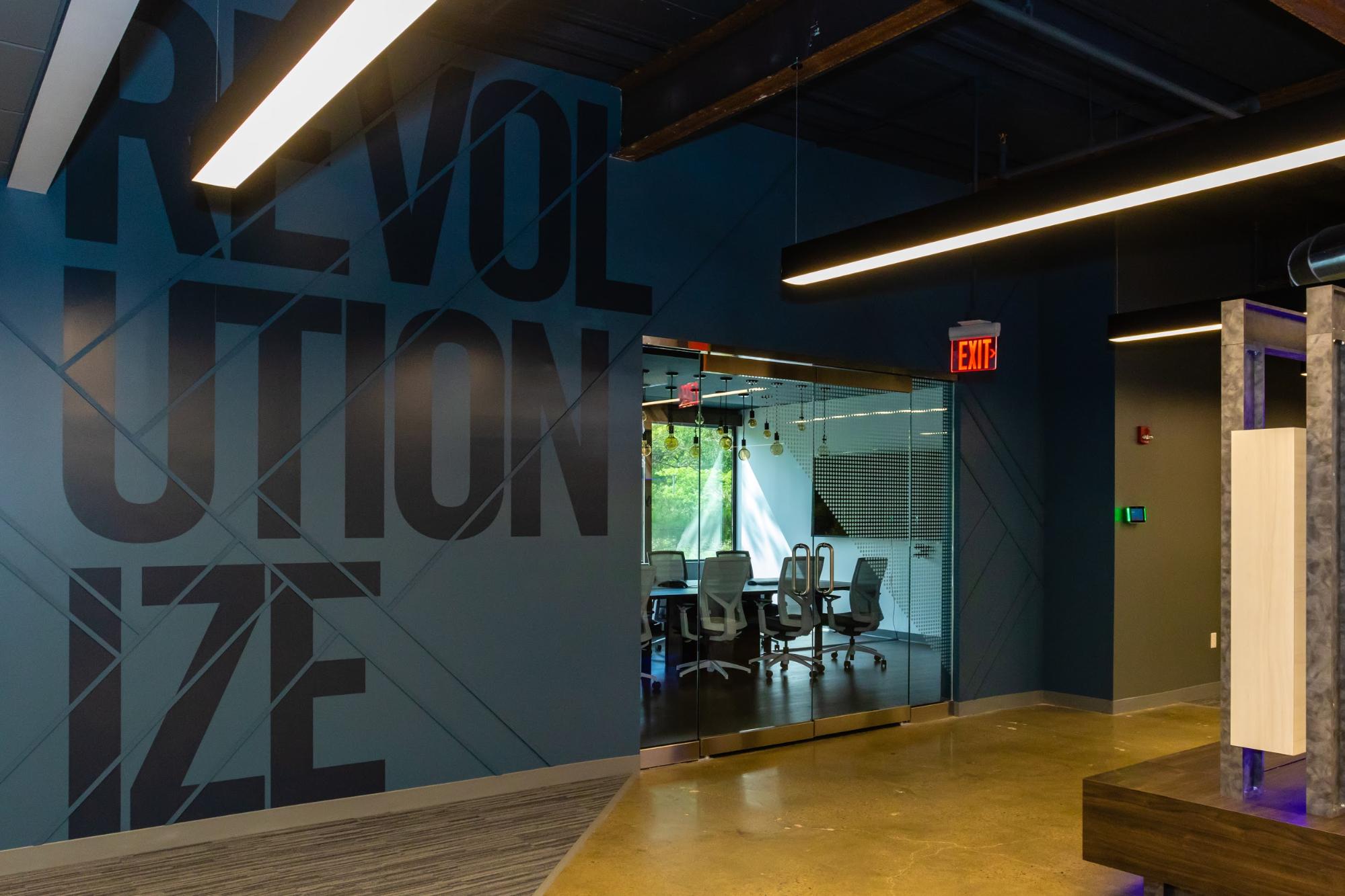
This inner space includes brand colors and the dot pattern on the glass for familiarity. It also features large-scale graphics to reinforce the company’s mission.
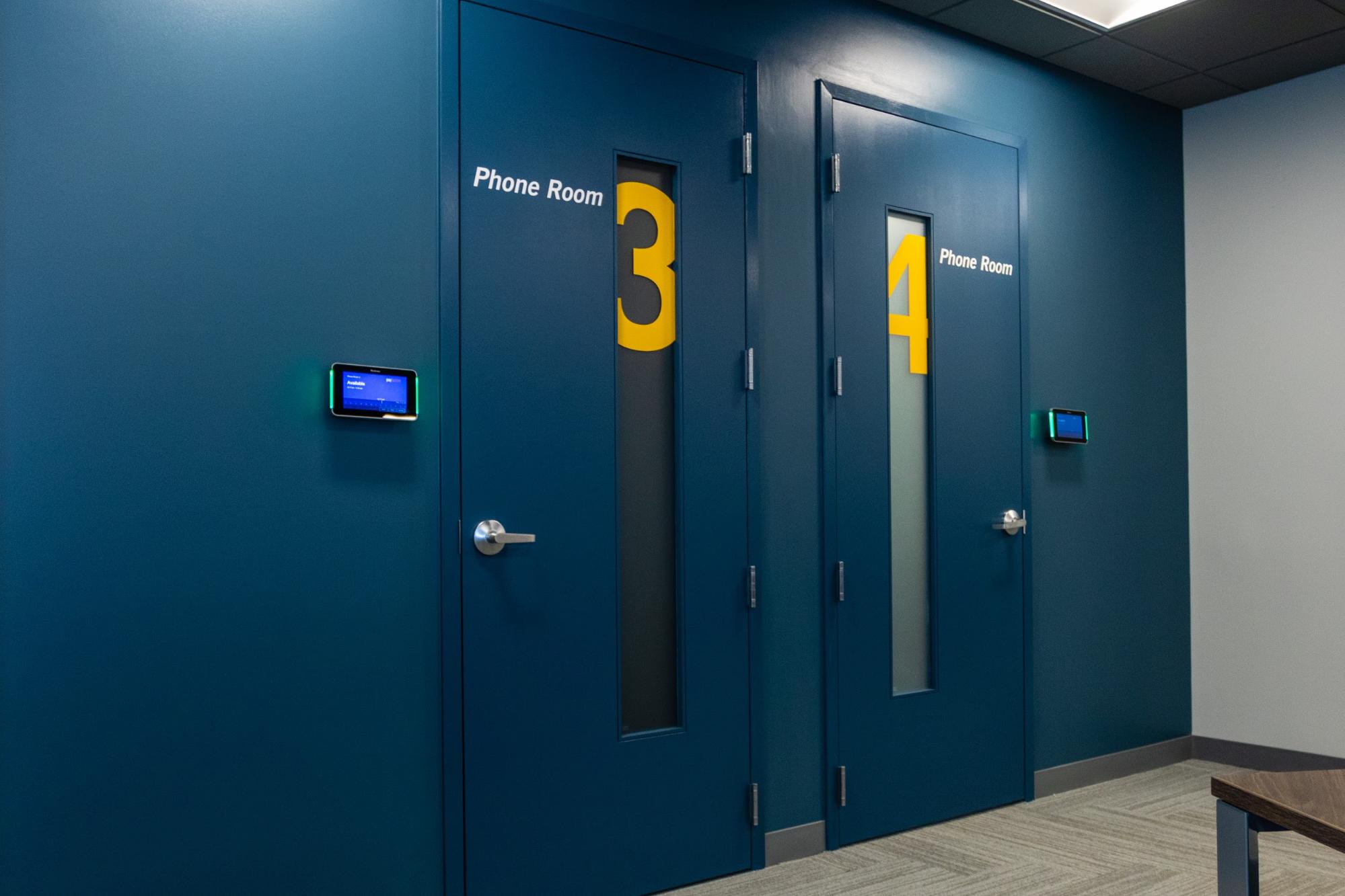
This quiet space has two phone rooms where people can have private conversations or just get away for a few moments. The rooms are splashed in brand colors and dramatic numbers as with the inner space above.
2. CloudHealth by VMWare’s CloudLIVE Event
CloudHealth hosted a conference in a newly built hotel. We helped them transform the lofty rooms into a uniquely branded space for attendees.
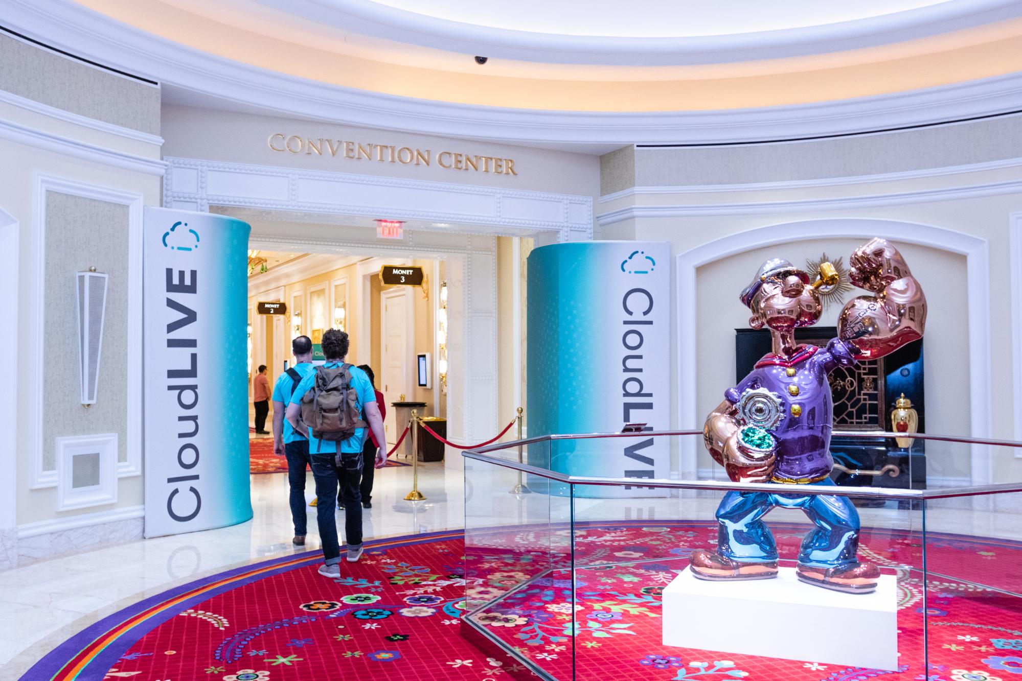
The entrance has large graphic pillars for wayfinding—we wanted to clearly denote this area was for the CloudLIVE event and immediately connect attendees with the CloudHealth brand.
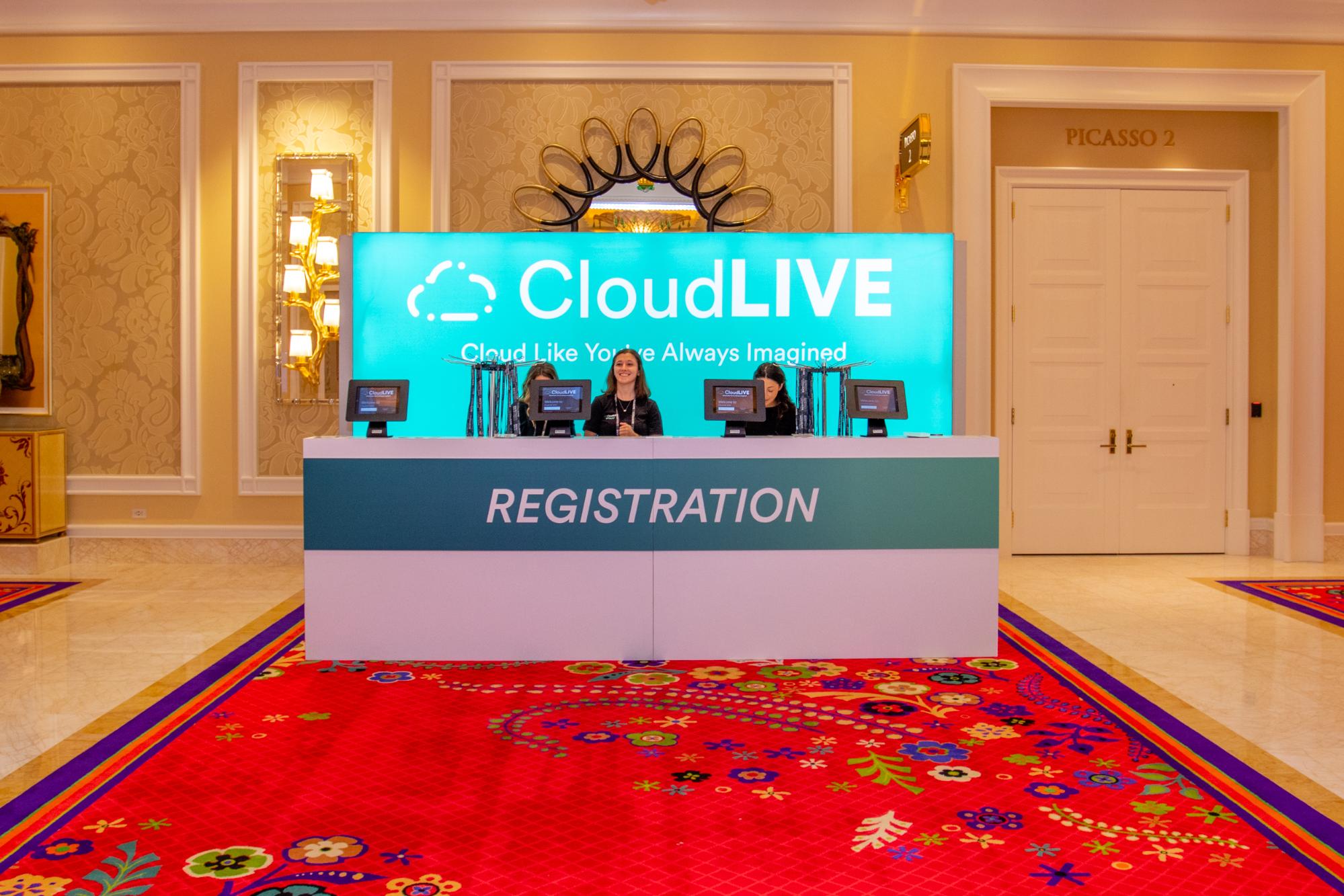
The long entrance hallway opens up into a large room. To make sure attendees had a clear starting point, we made the registration desk shown here. The typography was large enough that it could be easily read as people entered the room.
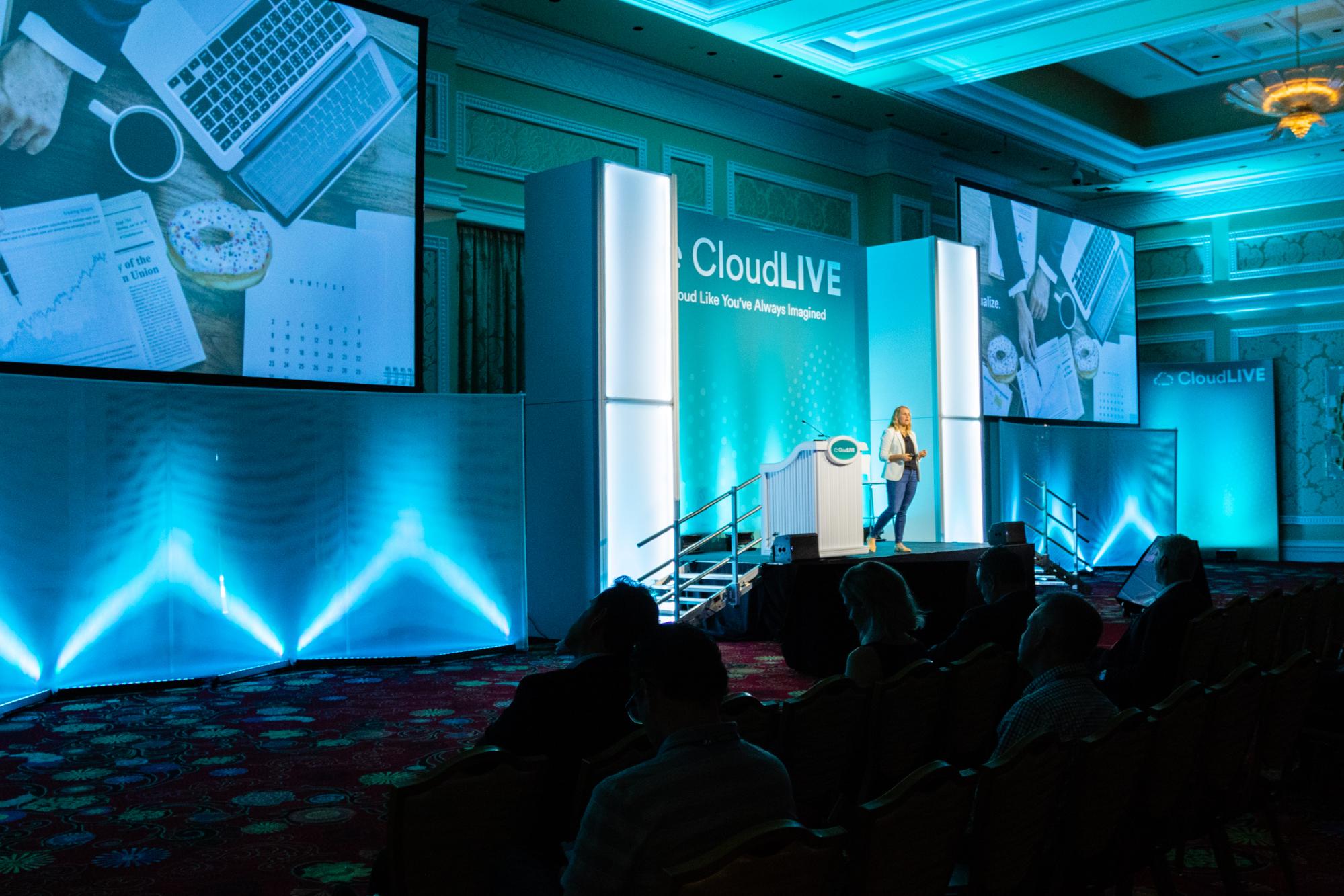
The session hall featured dramatic architecture and brand colors throughout. Even the lighting used these colors to accent the visual experience, evoke the brand, and set the right tone for attendees. The mesh canopies gave the light depth and texture. Large, white light boxes helped encapsulate the stage space.
3. Samsonite’s Trade Show Booth
The Travel Goods Association Show gives luggage manufacturers like Samsonite the opportunity to showcase their products to retailers. We helped Samsonite create this Branded Environment to show off their luggage in style.
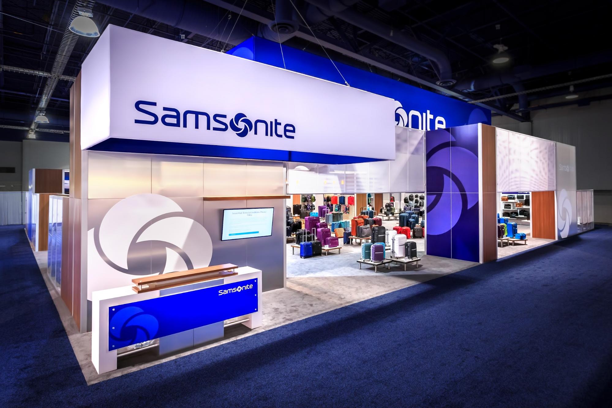
This 80-by-80 Branded Environment used large-scale graphics and brand colors to catch attention across the show floor. The entrance had a reception desk and screen to communicate to visitors they should begin there.
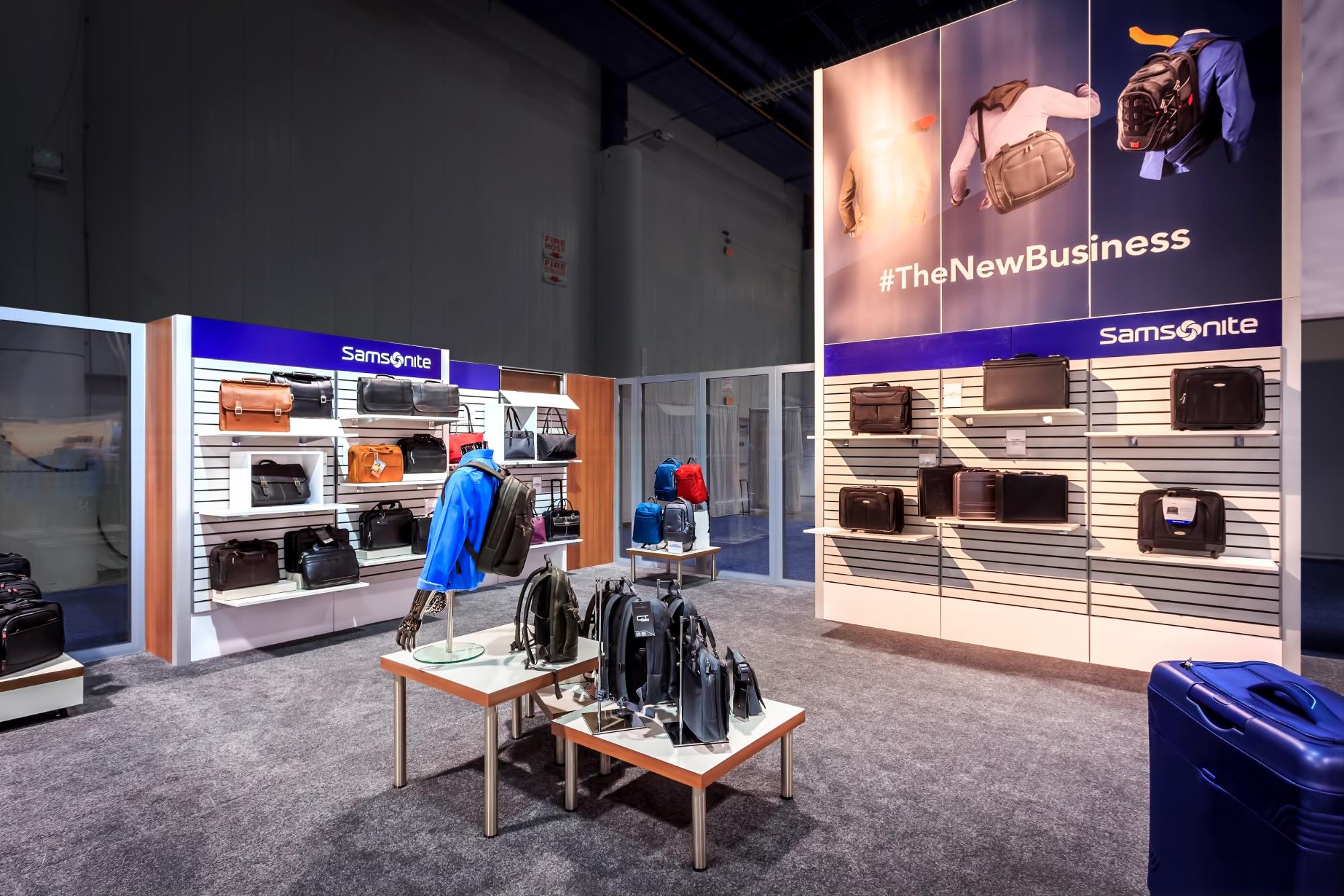
Given its large size, this space was segmented into several areas that each displayed different product lines. Each section had unique environmental graphics that aligned with the feel of the product line being displayed. The business section used wood textures, shelves, tables, mannequins, and other props reminiscent of a retail space. Clear plexiglass gave the feeling of window shopping.
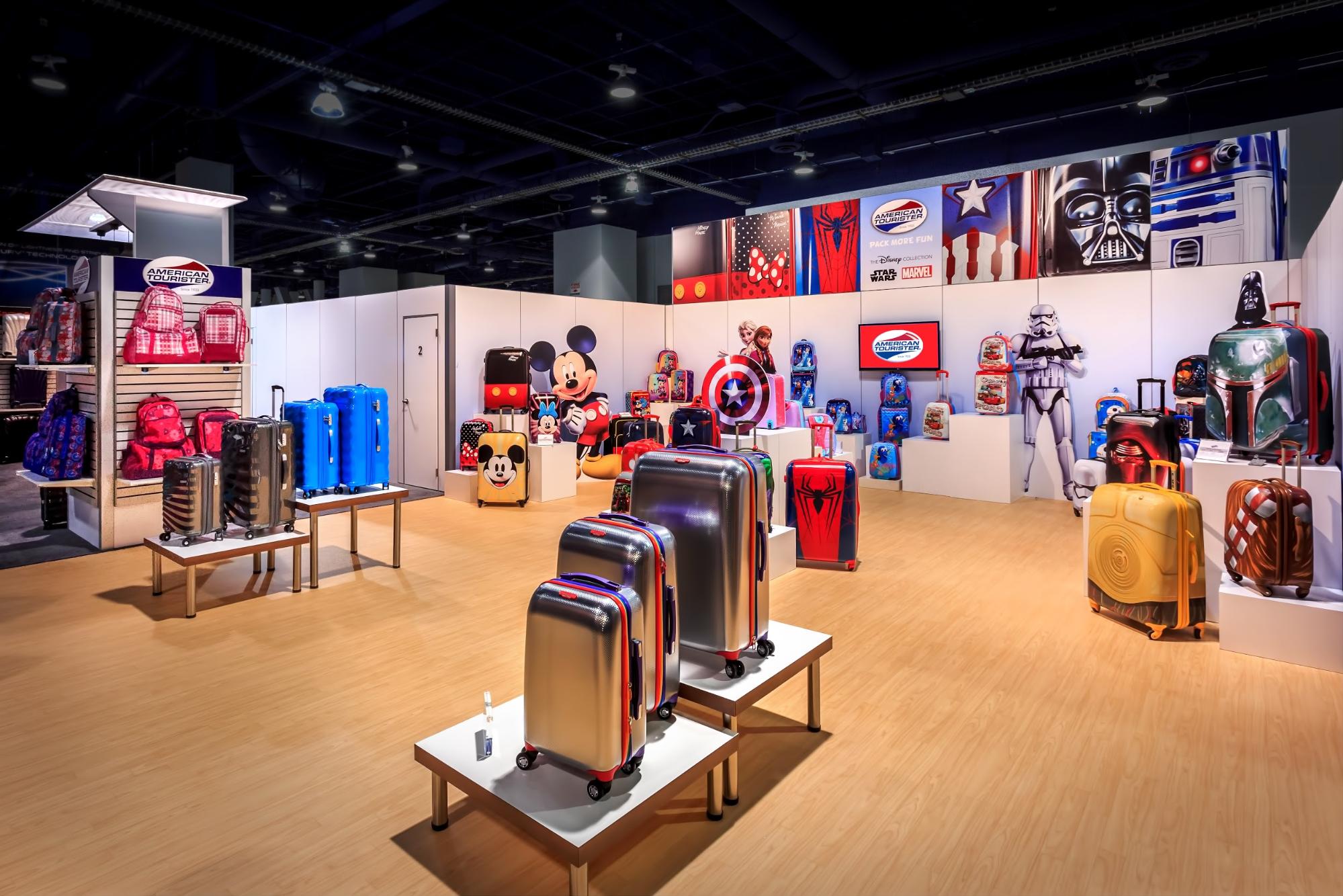
The kids’ section had a clear visual break, switching to vinyl wood over the business section’s carpet. This brand of Samsonite was partnered with Disney, so we included lots of environmental graphics from Disney properties like Marvel and Star Wars. Cutouts added depth, and the colors here were more vibrant compared to the business section’s muted palette.
Need a trade show services partner who has mastered the art and science of environmental graphic design and offers a turnkey solution? Reach out to us to talk about creating a uniquely customized space.
Topics: Featured, Trade Show Graphics